Designing a Jersey Without Drawing It
At work, we have a charity fitness challenge every summer. You run, ride or swim for a few weeks, the kilometers get counted, and money goes somewhere useful. This was the tenth edition. Nobody asked for a jersey. I suggested one to a few colleagues, then kept suggesting it until it was happening. Mostly I wanted to know whether I could design a garment that didn’t look like a corporate giveaway. I’ve been learning Houdini, so that’s the tool I reached for. This is a note on how it went.
Building the visual language
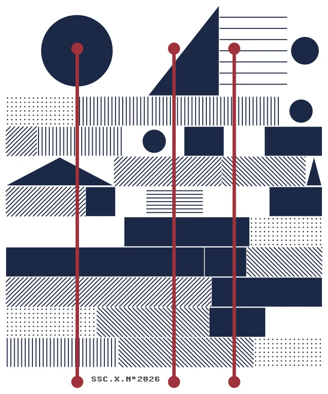
It took some experimenting to arrive at the track system. The layout is ten horizontal tracks, one per year of the challenge. 2017 is at the bottom, 2026 at the top, and the anniversary track is three times the height of the others. Each track contains geometric segments representing different kinds of training sessions. Read left to right, a row suggests a year of activity.
I didn’t make that vocabulary up on my own. I used the kinds of information recorded in Strava activities as a starting point: distance, moving time, elevation, races, indoor sessions and personal records. The idea was to build a vocabulary that a real activity log could feed.
This design doesn’t use anyone’s training history. I never called the API. The placements are procedural and driven by weights: settings that make some kinds of marks more likely to appear than others. I tuned those by hand until a row looked like a believable year, mostly steady work with a few hard days and a race or two.
These are the meanings I assigned to the main marks. The generator chooses them by weight, so the rows are suggestive rather than consistent training logs. Nothing prevents two wedges from appearing in the same year, for example.
- Solid block: a long session
- Gap: a week off
- Horizontal stripes: steady endurance work
- Vertical stripes: a fast session
- Diagonal stripes: a hilly or trail day
- Dots: short, easy sessions
- Outlined rectangle: an indoor session
- Triangle: a race
- Circle: a personal record
- Wedge: the longest session of the year
The system also has a few geometric variations beyond this key, including concentric circles, semicircles and stepped blocks. Not every option made it into the final design. Outlined rectangles, for example, ended up with their weight set to zero.
Late in the process, I replaced several of the guessed values with real numbers from the challenge: the number of disciplines, the total participants and the size of each team. Those values fed into the weights controlling how often different marks appeared in each track. You can’t read the original figures back from the jersey, but they influenced its composition. It just felt better to use numbers that belonged to this group.
Three red vertical lines cross the whole thing, one per discipline. The circles at their ends are a visual touch. I liked giving each line a start and a finish.
The system also supports personalisation. The wearer’s disciplines determine which lines appear, and the number of past challenges adjusts their length. That number also changes the variety of shapes available to the ordinary tracks, while the anniversary track always has access to the full vocabulary. For this batch, we kept one design for everyone to keep costs down, so all three lines run the full height.
The text at the bottom carries the edition and 2026, the year I used as a starting point for the seed. The actual input is 0.2026. I tried 2026, then its decimal version, and preferred the composition that 0.2026 produced with my chosen weights. I kept 2026 in the printed text as a reference to the year. I also tried placing the number among the tracks, but it drew too much attention to itself. Moving it to the bottom let the pattern take priority.
One reference was Frieder Nake’s Hommage à Paul Klee from 1965, where each horizontal band keeps its own rhythm and only loosely acknowledges the others. There’s some Vera Molnár and some Bauhaus in it too. The rows here are deliberately not on a shared grid. Each is its own year, and the slight disagreement between them is what stops it from being wallpaper.
Colour was decided in the wrong order, which turned out fine. The vendor offers a fixed set of base colours for the jersey itself. There were plenty, and I went with a light cream on the assumption that this would be a hot summer and a light jersey would make more sense than a dark one. That left two colours for the design. I didn’t want to get into colour theory, so I opened Sanzo Wada’s A Dictionary of Color Combinations and picked a pair that sat well against cream: a deep navy for the tracks and Madder Red for the vertical lines.
Making it in Houdini
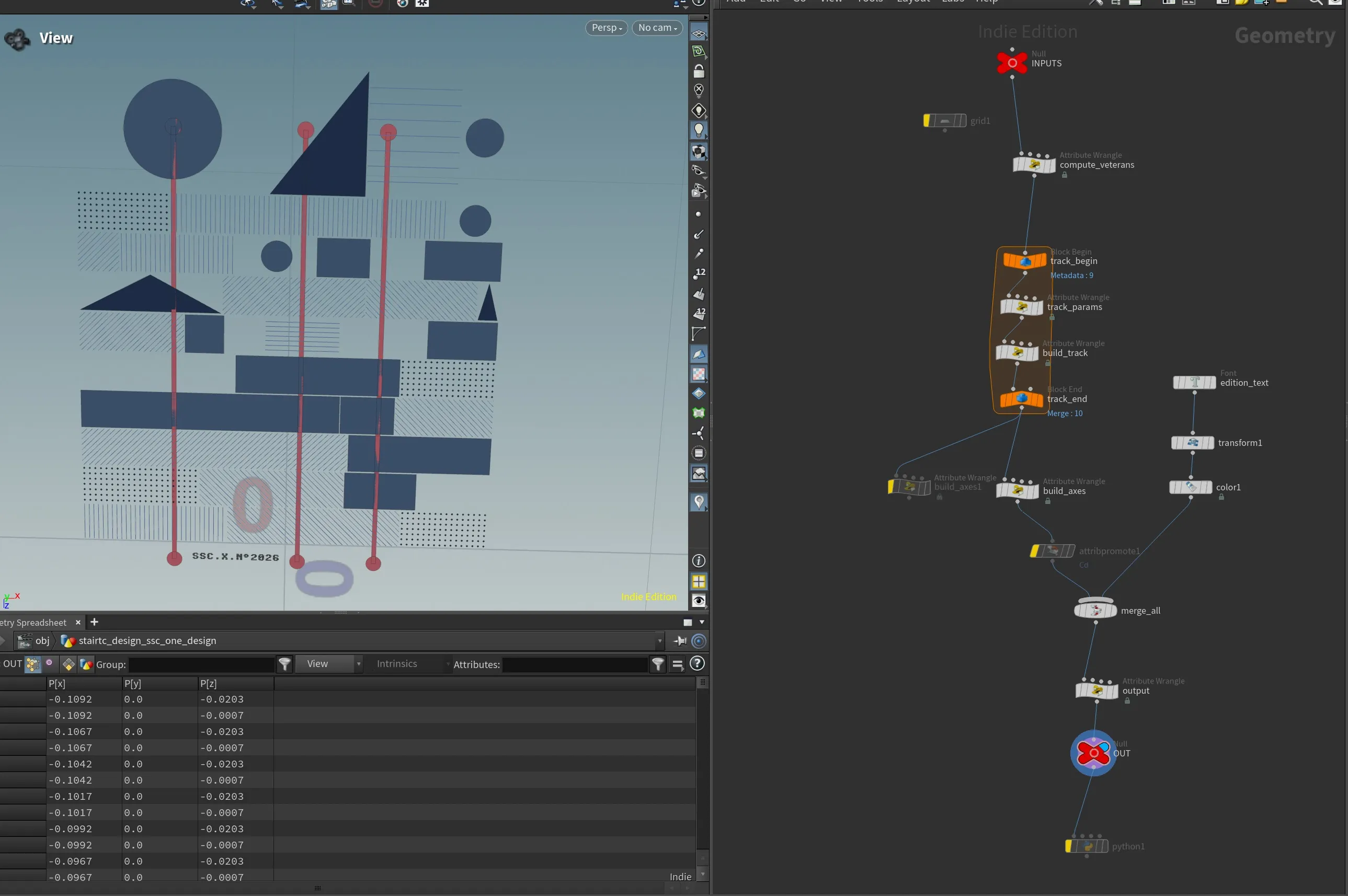
The whole design is one geometry network in Houdini. Nearly all the work happens in a handful of Attribute Wrangles, nodes containing code written in Houdini’s VEX language. There is no drawing involved.
A control node at the top holds the seed, three toggles for swim, run and cycle, and the number of past challenges. The track-building node has another set of controls for segment counts, widths, pattern weights and the spacing inside each mark.
A loop runs once per year. Each pass works out where its row sits and how many segments it gets. It divides the width of the row into segments of varying sizes, picks a pattern for each one, and builds the shapes as geometry: filled polygons for the solid marks, lines for the hatching, tiny diamonds for the dots.
Another wrangle draws the red lines. A Font node adds the text, and it all merges into one flat design. With the other settings unchanged, the same seed always gives the same jersey, and a different seed gives a sibling.
Once the network existed I wanted to see what else it would produce, so I animated it. That was more work than I’d assumed. Keyframing the inputs alone gave jumpy, unreadable results. I went back into the VEX and reworked parts of it so segments could move and resize smoothly over time.
The design reorganises itself continuously, as if someone were fiddling with the dials. I like watching it because it shows how many other versions were possible. The jersey is one frame of a process that could have stopped somewhere else.
Taking it to fabric
For the edge-to-edge design I wanted, we went with sublimation, where the dye goes into the fabric rather than sitting on top. That brought a problem I hadn’t planned for. A design made of fine hatching depends on whether thin lines survive the transfer.
I wrote a small Python script to export the geometry as vector artwork. I opened the result in Inkscape and Affinity to make sure nothing had gone missing before sending it off. The test print would let me check how the hatching actually looked on fabric.
If we’d been limited to flock or screen printing on a chest panel, I would have tried snapping the tracks to a shared grid for a tighter, more Bauhaus version. At the full width of the garment, I preferred the loose arrangement.
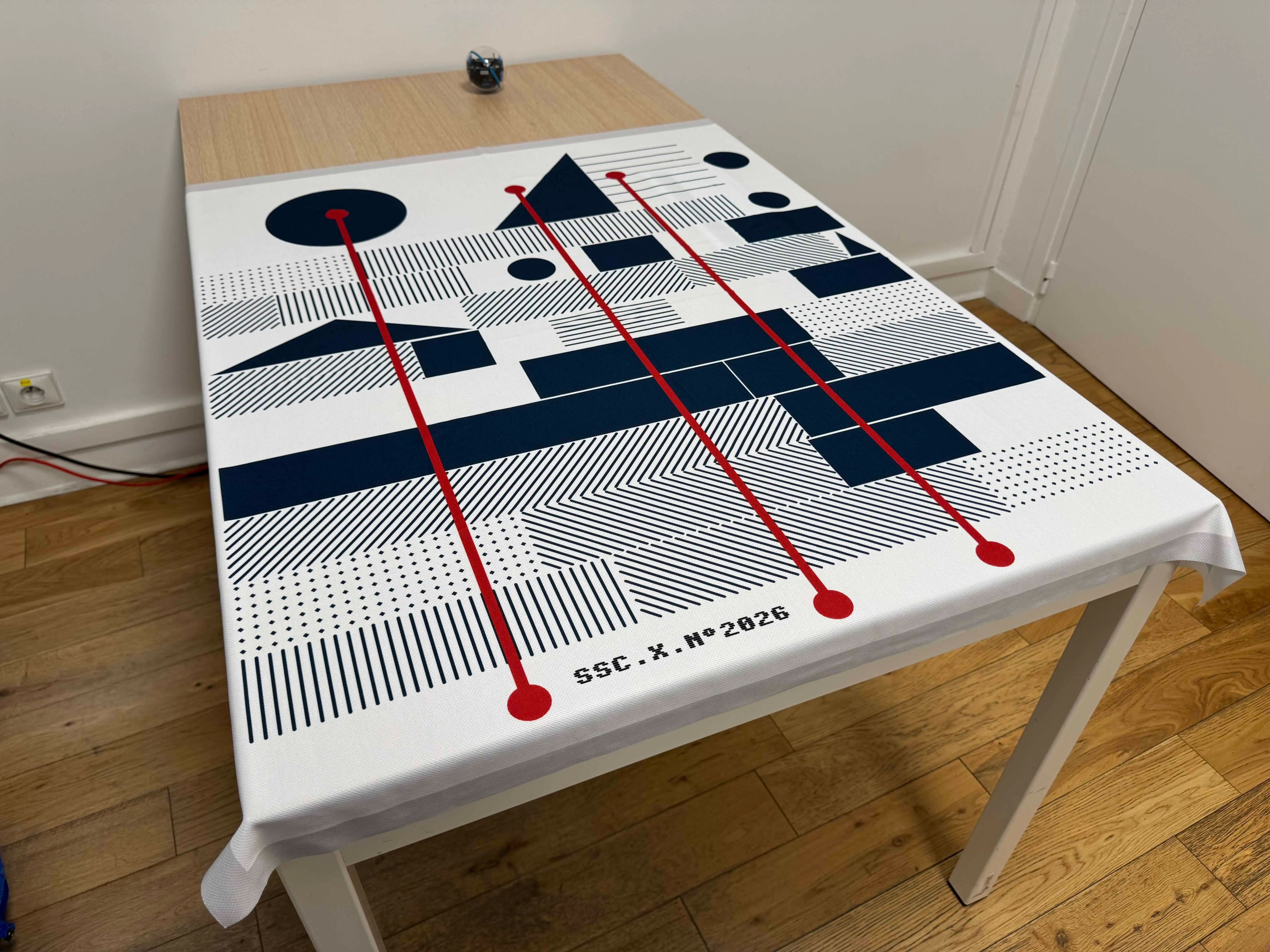
Test print on the jersey fabric. The fine hatching was what I wanted to check.
We printed with owayo.fr. They had no minimum order, which matters when you’re making just thirteen jerseys, and their fabric is what you’d expect from a proper sports jersey. They also sent a test print on the material before running the final batch. That swatch confirmed that the fine hatching came through clearly on the fabric.
My one complaint is the collar, which is narrower than I’d like. Nobody else minded, so that’s on me.
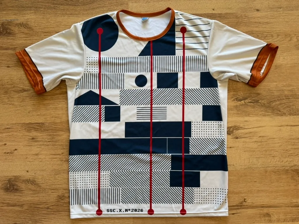
The challenge had already started while I was working on this, so there wasn’t much time to keep refining it. The Houdini network is a bit of a mess, with earlier ideas still sitting alongside the version I ended up using. I spent the time getting the composition and print file where I wanted them. Cleaning up the network will have to be a separate job.
I enjoyed this more than I expected. Part of it was the puzzle of inventing a visual language for a decade of training. Part of it was learning what a printer needs from a file and what fabric does to a thin line. And part of it was simply watching a network I’d built produce something I could wear.
I’d assumed Houdini and jerseys had nothing to do with each other. They get along fine. Next time I’ll start there, or in TouchDesigner, and see what comes out.